Role: UI/UX Designer Tools: Figma Timeframe: 8 weeks
Project Overview
Sustain-A-Look, a sustainable fashion brand from Boulder, Colorado, hired my team to redesign their website. The primary goals were to support their expansion to a nationwide audience and launch a new recycled clothing program. My role evolved from Team Lead to also cover the responsibilities of the Senior UX/UI Designer.
The project required a complete redesign of the website prototype to optimize navigation, create a seamless and accessible purchasing experience, and develop new pages for the recycling initiative, all while adhering to a strict brand style guide.
Core Objectives
- Optimize website navigation
- Launch the Recycle Program
- Ensure WCAG 2.1 AA accessibility
- Create a consistent, on-brand experience
- Improve the e-commerce flow
The Challenge: User Feedback
The initial design suffered from several critical usability issues identified in user feedback and journey maps. These pain points were the foundation of our redesign strategy:
Confusing Checkout
"Users struggle to navigate back to the Marketplace page from the Checkout page."
Poor Readability
"Users with visual challenges find it difficult to read some of the content."
No Product Filtering
"Users find it difficult to search for/filter products on the ‘Marketplace’ page."
The Solution: A Streamlined Redesign
(prototype images below)
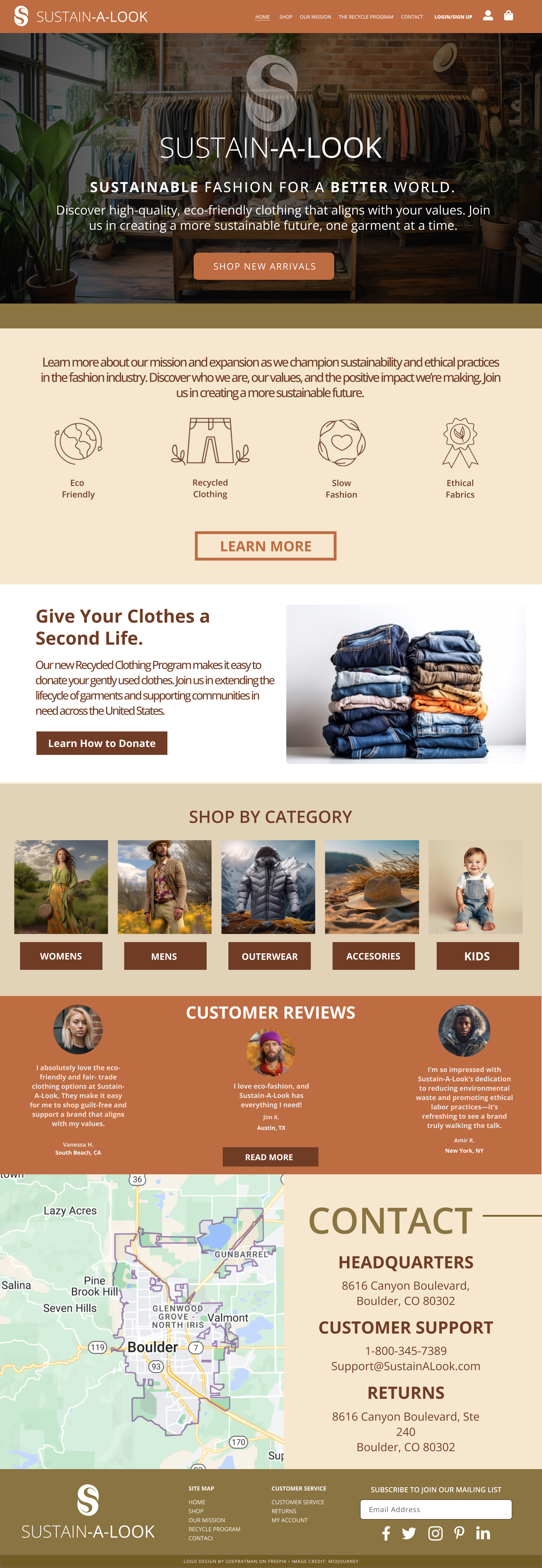
Redesigned Homepage
The new homepage immediately introduces the brand's mission and the new Recycle Program. We replaced the local Boulder map with nationwide-focused messaging and imagery to support the brand's expansion.
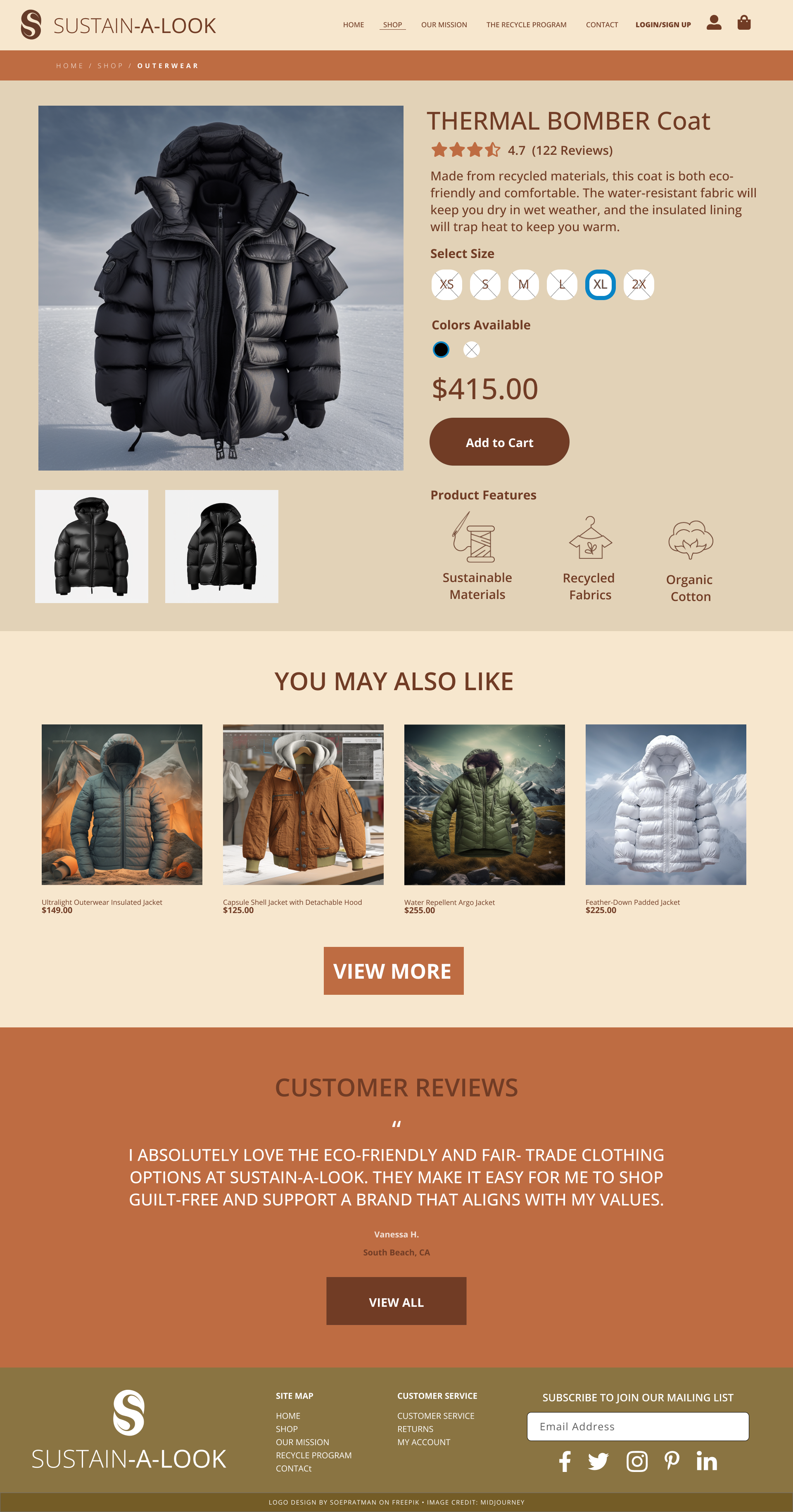
Shop Page with Filtering
To solve a major user pain point, we introduced a clear sidebar with options to filter products by category, size, and price, making the shopping experience more efficient and user-friendly.
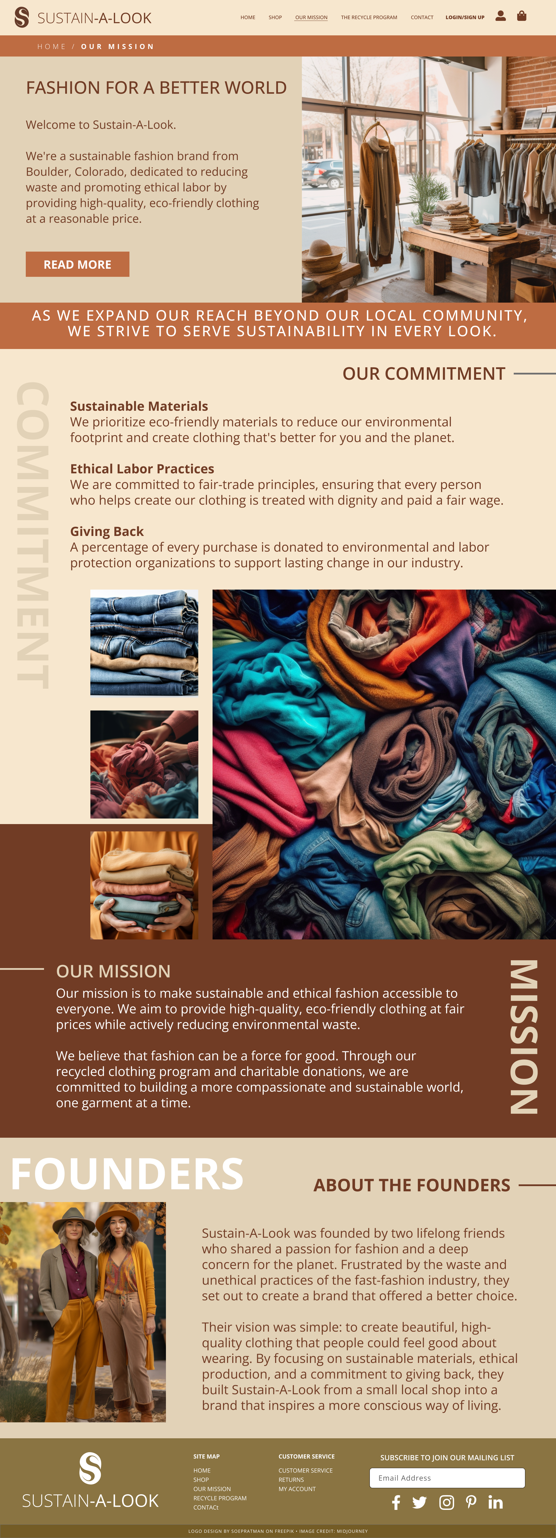
Recycle Program Page
We designed a new, dedicated page for the recycling initiative. The text was streamlined into scannable sections, using icons and a clear step-by-step guide to explain the process.
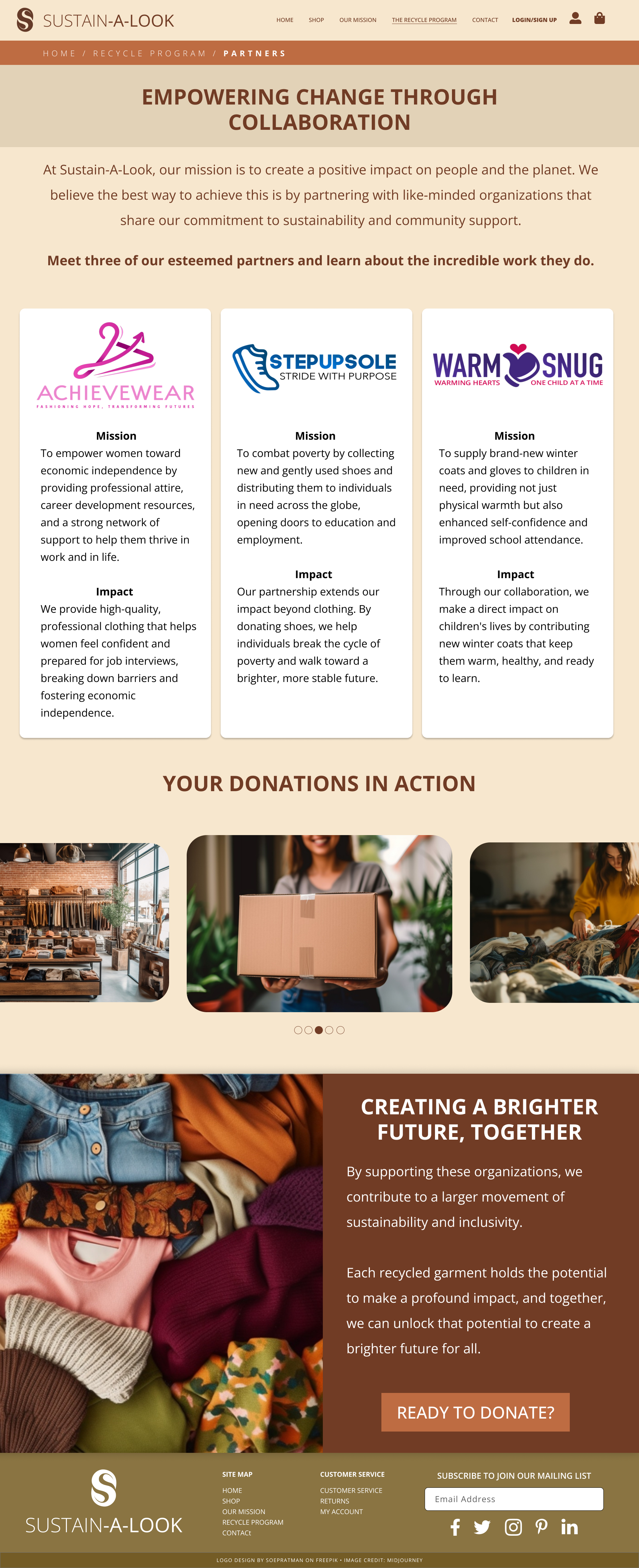
Partners Page
This page builds trust by showcasing the partner organizations. Using Gestalt principles of proximity, each partner's logo, mission, and impact are grouped into clear, digestible cards.
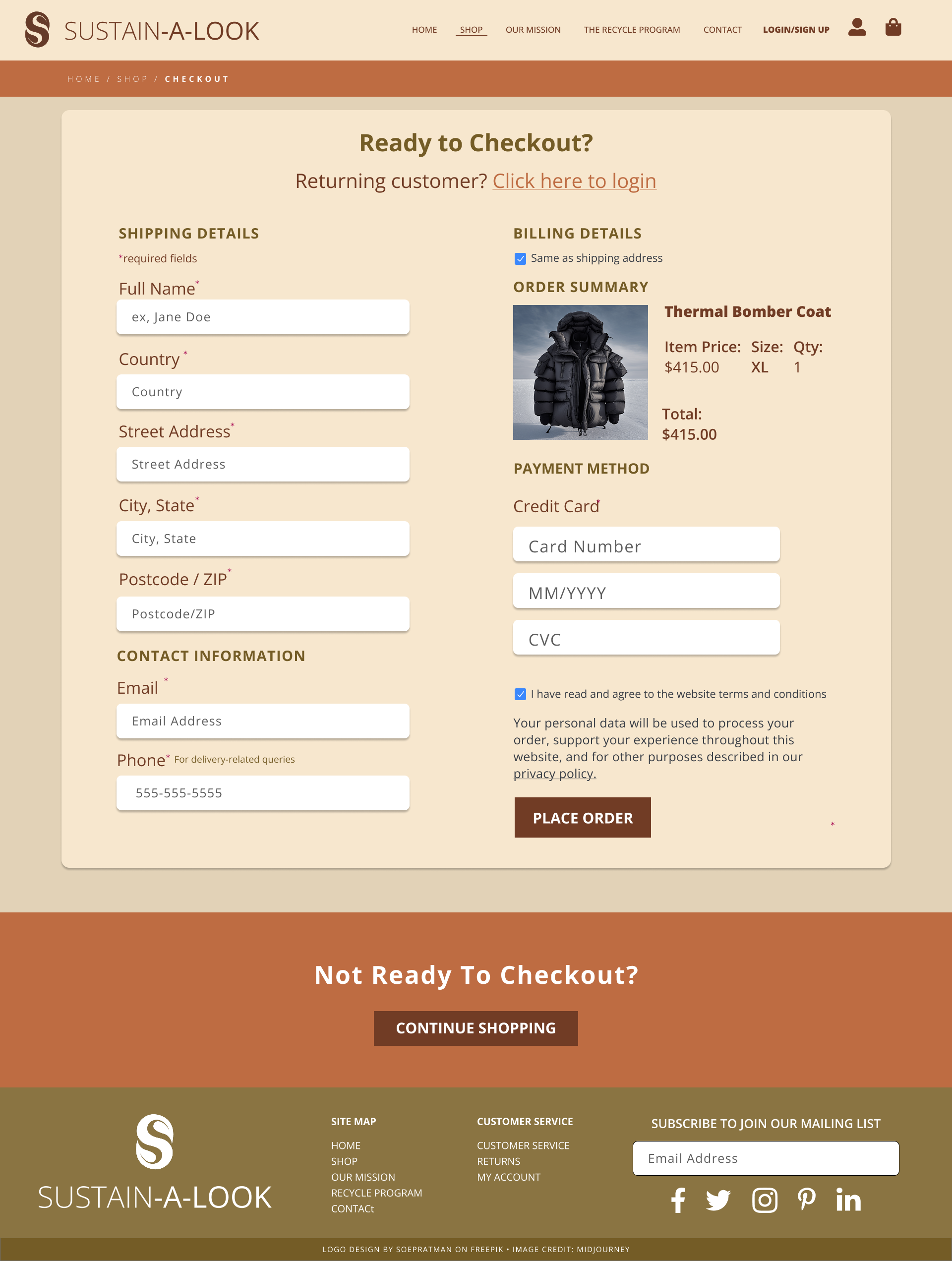
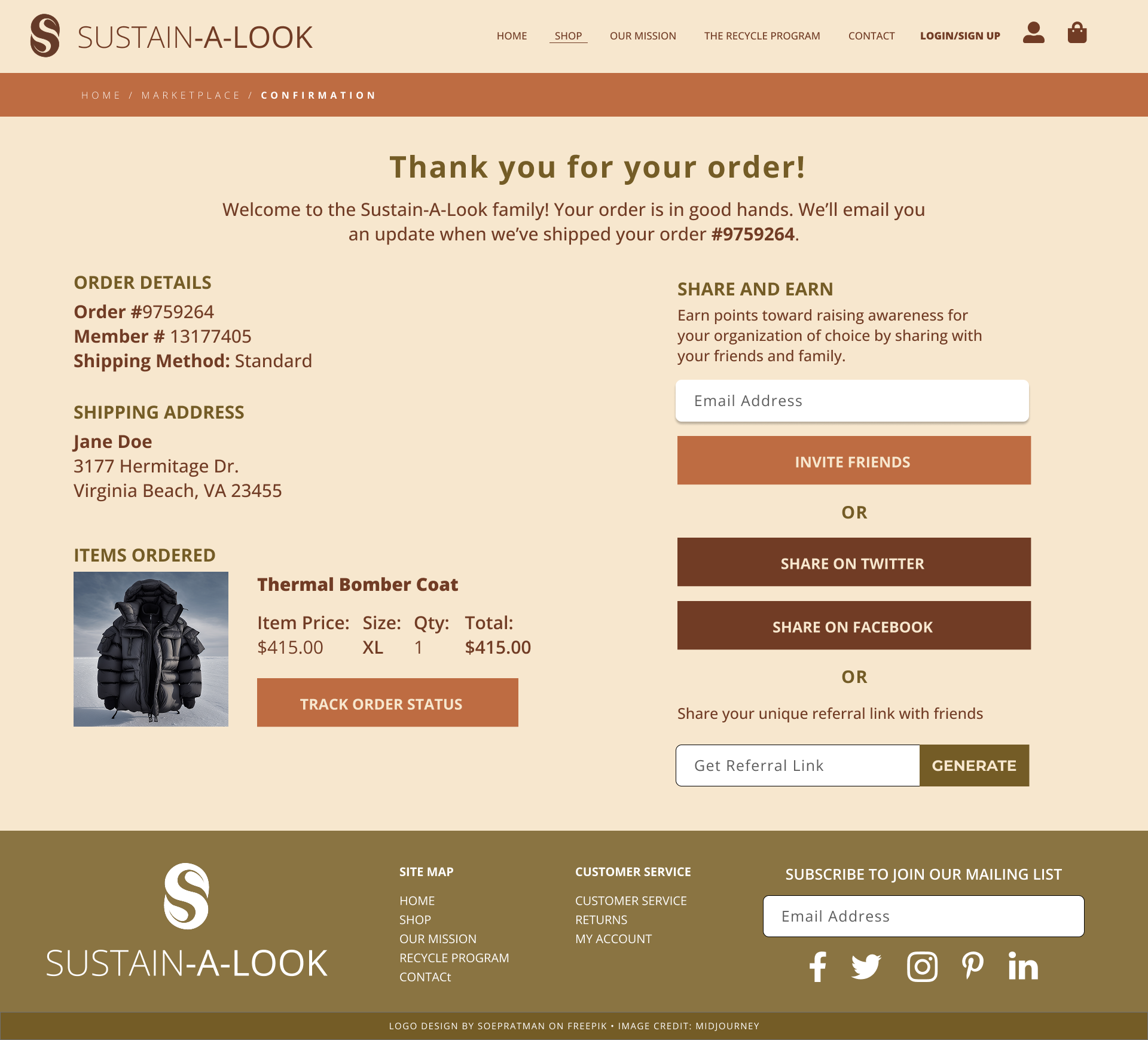
Optimized Checkout Page
The checkout was completely overhauled to solve critical usability issues. It now includes a clear "Order Summary" for review and a "Continue Shopping" button to prevent users from feeling trapped.


Project Management & Professional Growth
Managing Scope Change
A significant challenge in this project was a client request to add a mobile app midway through the process. As the team lead, I evaluated the impact on our timeline, process, and staffing.
I drafted separate communications for our internal team and the client, clearly outlining the need for an extended timeline and additional staffing to deliver a high-quality app without compromising the website launch.
Professional Development
This project highlighted key areas for my professional growth. My self-assessment identified a need to improve my foundational skills in Figma and my collaboration abilities with stakeholders.
My development plan focuses on completing advanced Figma tutorials, deconstructing complex websites to understand their information architecture, and actively participating in online design communities to practice giving and receiving feedback.
Thank you for reviewing my project.
This is a conceptual project created for educational purposes.
