The purpose of this project was to establish a brand-new, premium digital experience for the FlyHorizon airline. The client sought an immersive, highly accessible platform built from scratch to integrate media consumption with in-flight services and crucial travel data.
Key Design Successes:
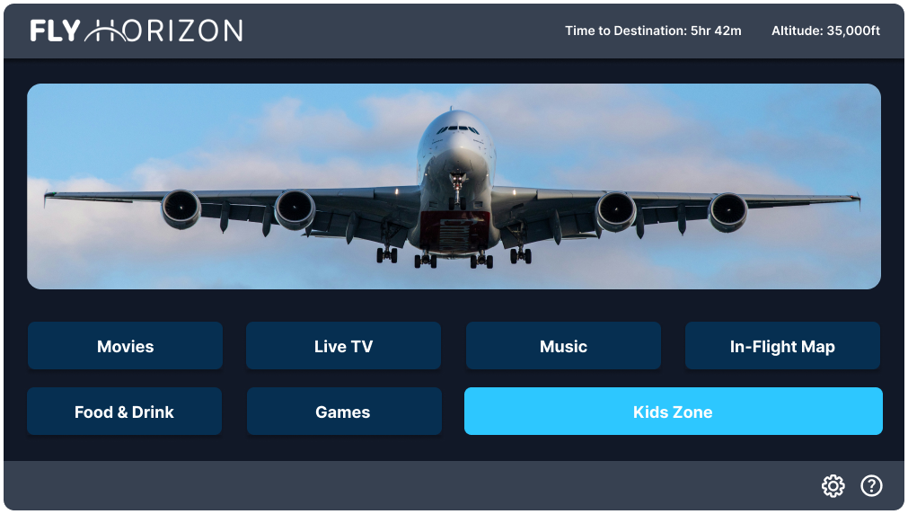
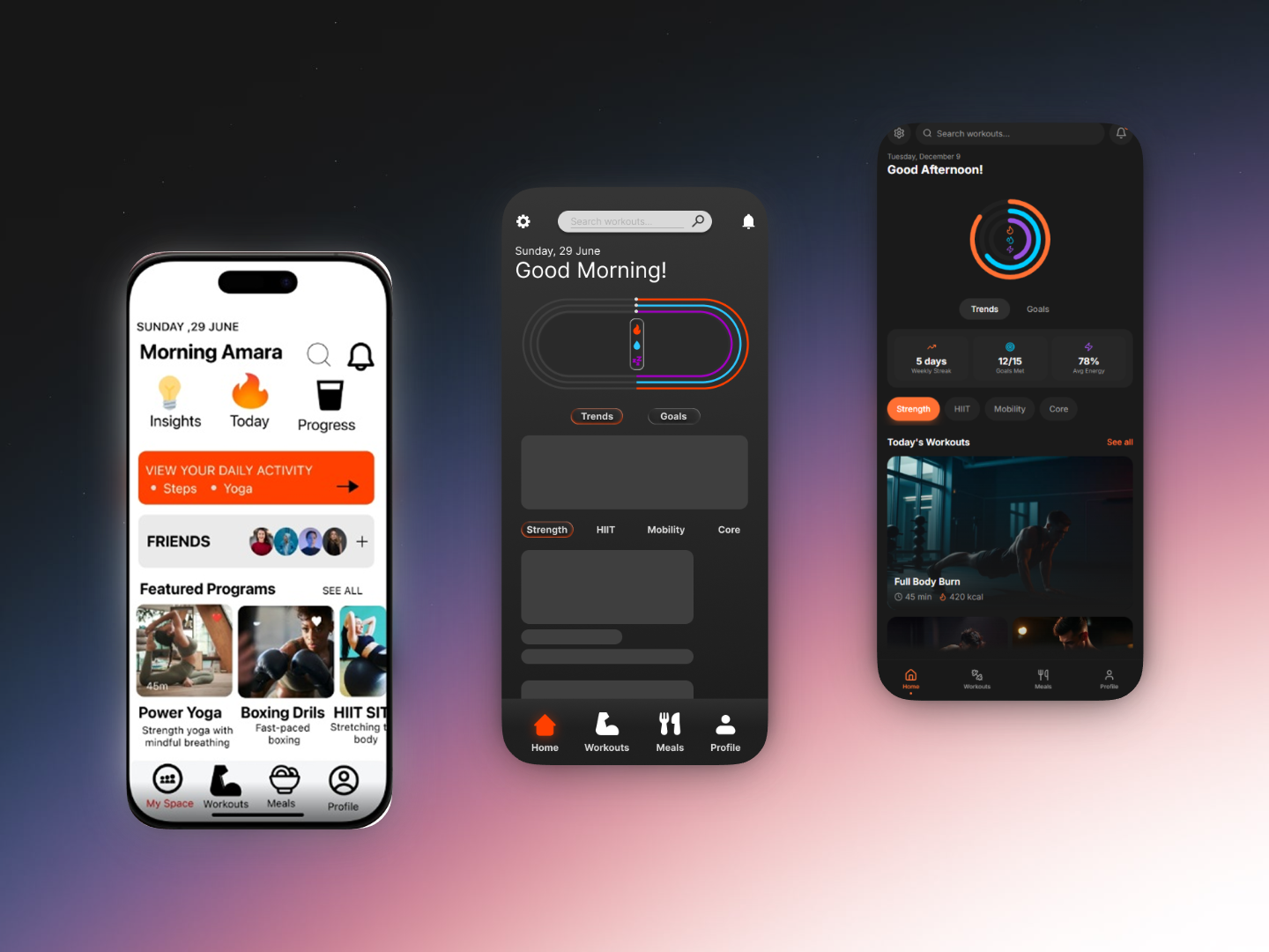
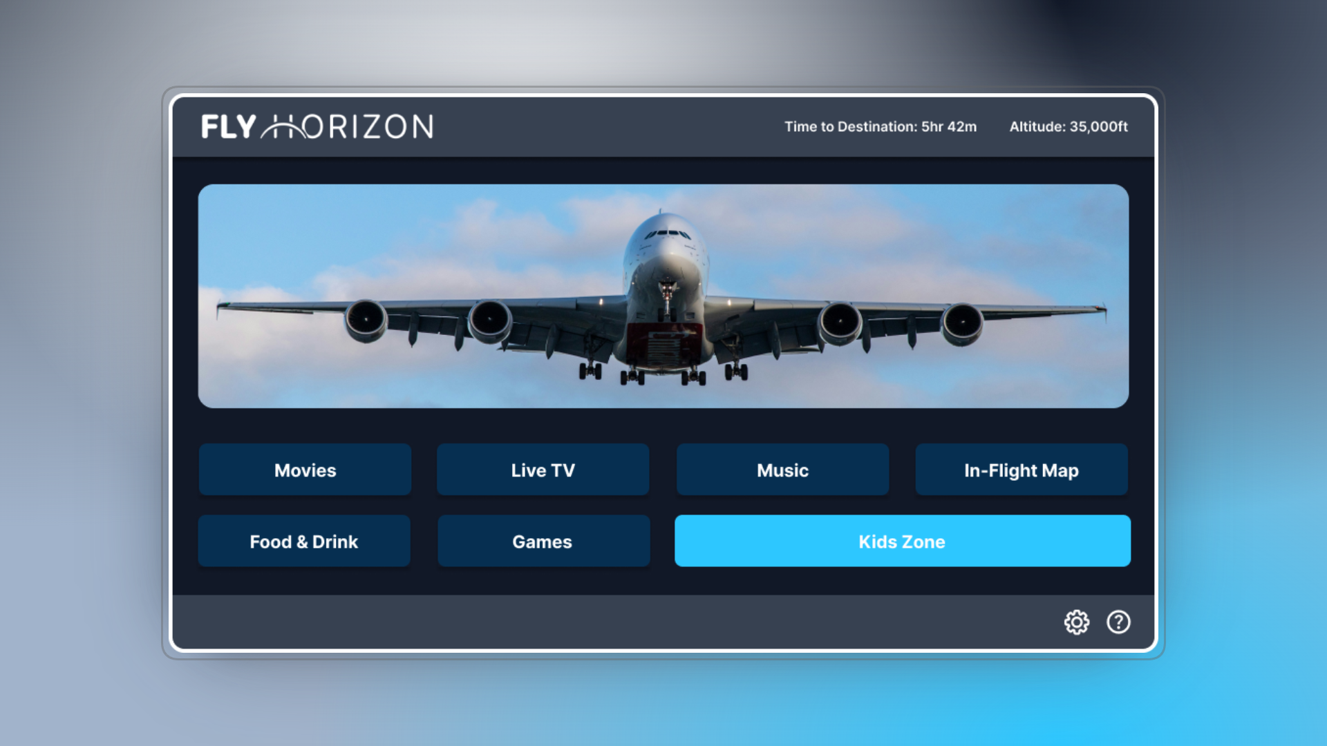
A strategic shift to a Dark Mode theme optimized for low-light cabin use; implementation of persistent navigation and touch-first targets; and the creation of a cohesive Component System to ensure visual consistency and scalability.
The Client Vision & Target User
The design was guided by the client's vision for a premium, modern experience and validated by the needs of the
Solo Explorer, Tshering (age 25).
Solo Explorer, Tshering (age 25).
Effortless Switching: Tshering needs to transition quickly between entertainment and essential flight data.
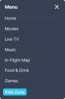
Solution: Implemented Persistent Navigation and clear, large entry points on the Home screen.:
Immersive Experience: Tshering values deep focus on content without visual interruption.
Solution: Adopted the Dark Mode Theme to minimize eye strain and ambient light distraction.
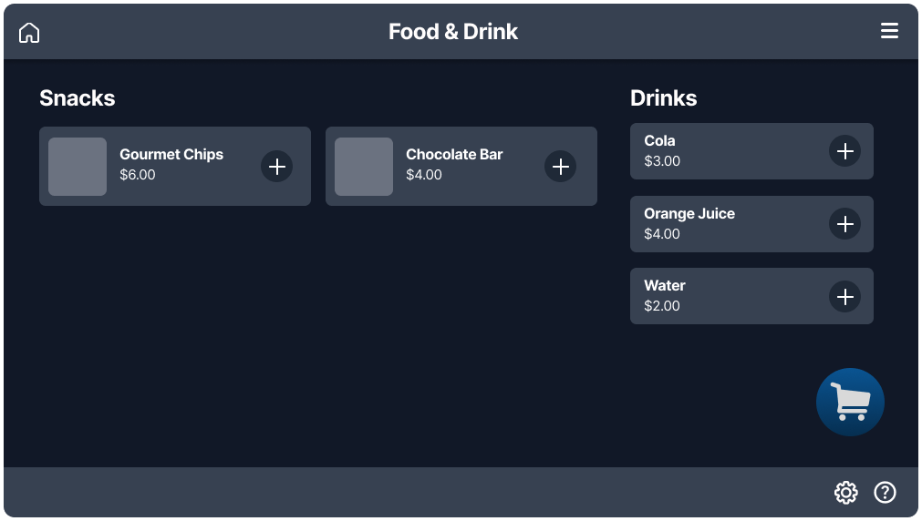
Control & Convenience: Tshering wants immediate access to service (ordering food) without having to wait.
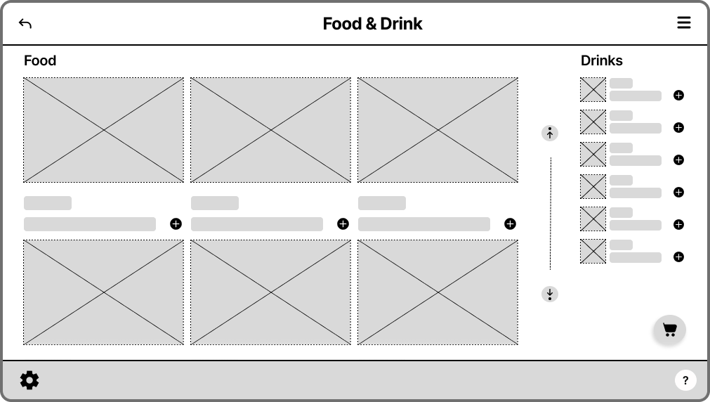
Solution: Created an intuitive e-commerce flow with Cart Status and large "Add to Order" touch targets.
Defining Success: User Stories
The design solution addresses core passenger needs as defined by the user stories:
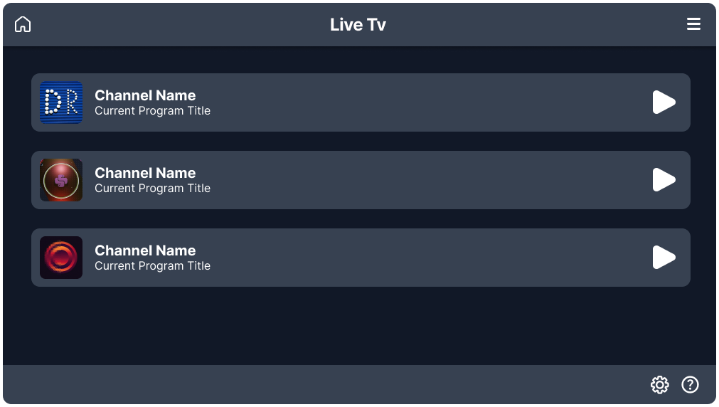
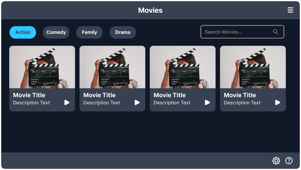
Seamless Navigation: The Persistent Navigation Menu allows the user to switch between any screen (Movies, Food & Drink, Map) without returning to the home screen.
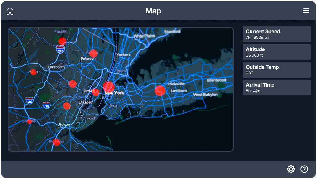
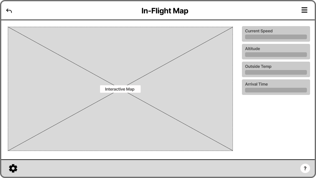
Situational Awareness: The Interactive In-Flight Map provides real-time location, speed, and ETA, keeping the traveler connected to their journey.
Convenient Service: The Food & Drink E-commerce Flow enables direct, seat-side ordering, eliminating the need to wait for a flight attendant.
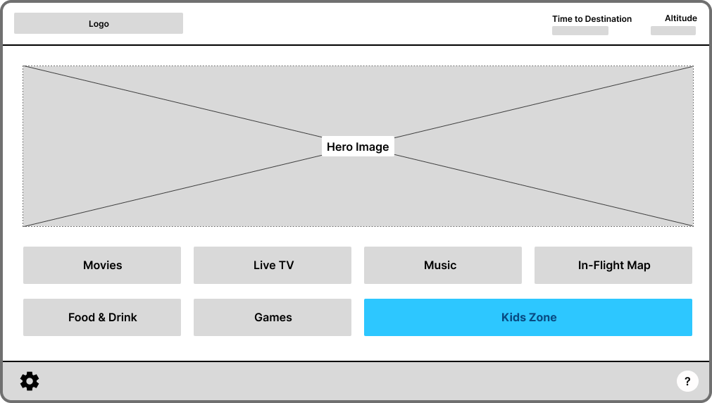
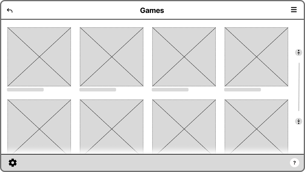
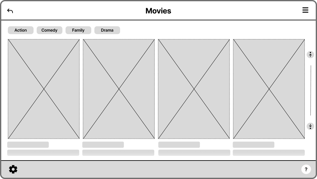
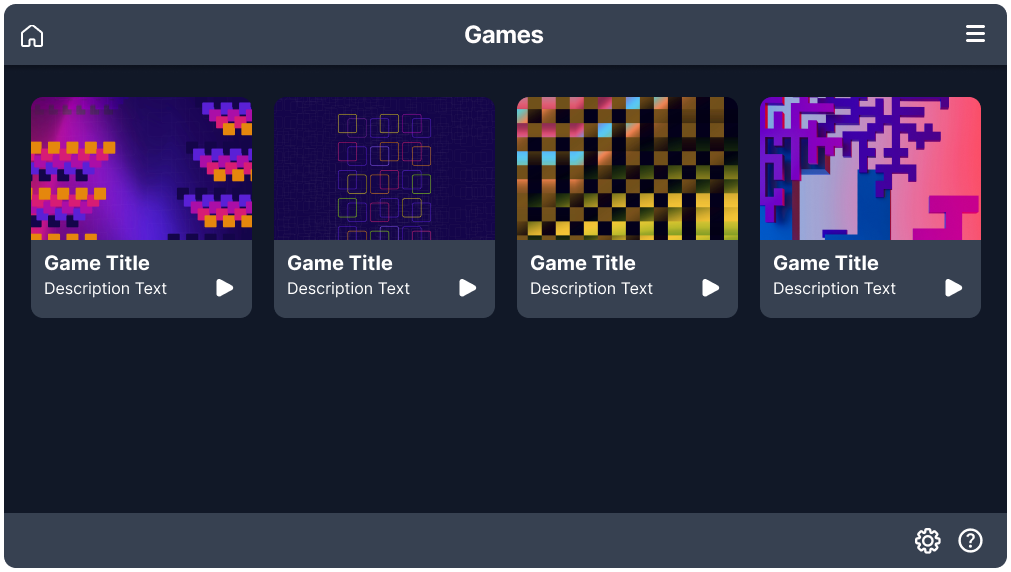
Low-fidelity wireframes established a persistent bottom navigation area for utility icons and validated the three-column content grid used in the Movies/Games sections to maximize screen real estate.
Design System: Consistency at Scale
Defining reusable components ensures that every interaction is visually and functionally predictable across the entire platform. This significantly reduces development time and minimizes cognitive load for the user.


The "Why"
Constraint-Driven Visual Design (Low-Light Readability)
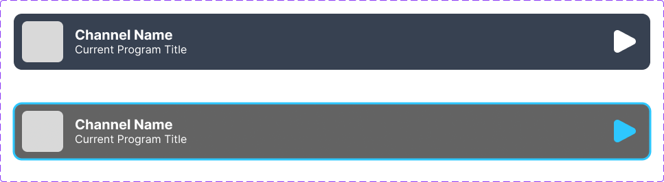
Decision: Default Dark Mode Aesthetic
Rationale: The choice of a deep navy/gray palette is a crucial Accessibility and Comfort feature. By reducing emitted screen brightness, the design prevents glare and eye strain for passengers in the dark cabin environment. This high-contrast approach also ensures WCAG AA contrast standards are met.
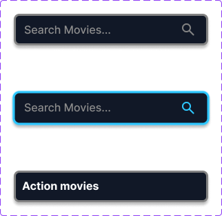
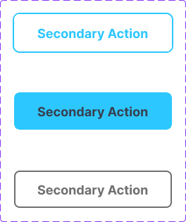
Decision: Vibrant Cyan Reserved for Action
Rationale: The bright cyan hue is strategically reserved for Focus States (e.g., search bar outlines, selected items) and Secondary Actions (e.g., "Kids Zone," food ordering status). This maintains a clear Visual Signal Hierarchy, drawing the eye only to interactive elements and status indicators without introducing unnecessary visual noise.
Interaction Design for Touch-First Input
Decision: Large, Predictable Touch Targets
Rationale: Adhering to Fitts' Law, all critical interactive elements (buttons, media cards) are sized with generous padding. This design decision directly addresses the constraint of in-flight vibration and imprecise touch input, minimizing selection errors and reducing user fatigue.
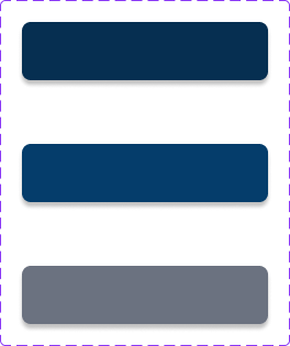
Decision: Modular Component System
Rationale: The foundation of the design utilizes an 8-pixel base unit spacing system and a reusable component library. This ensures that every element, from the Media Card to the Toggle Switch, is predictable, scalable, and maintains consistent visual weight, a key requirement for a professional and maintainable system.