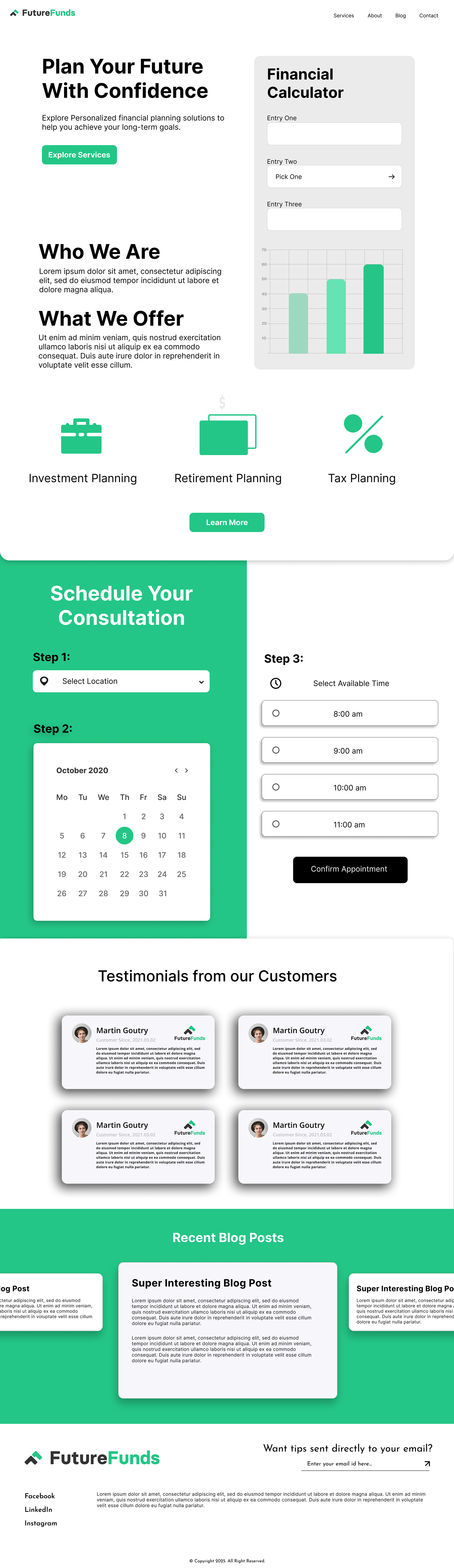
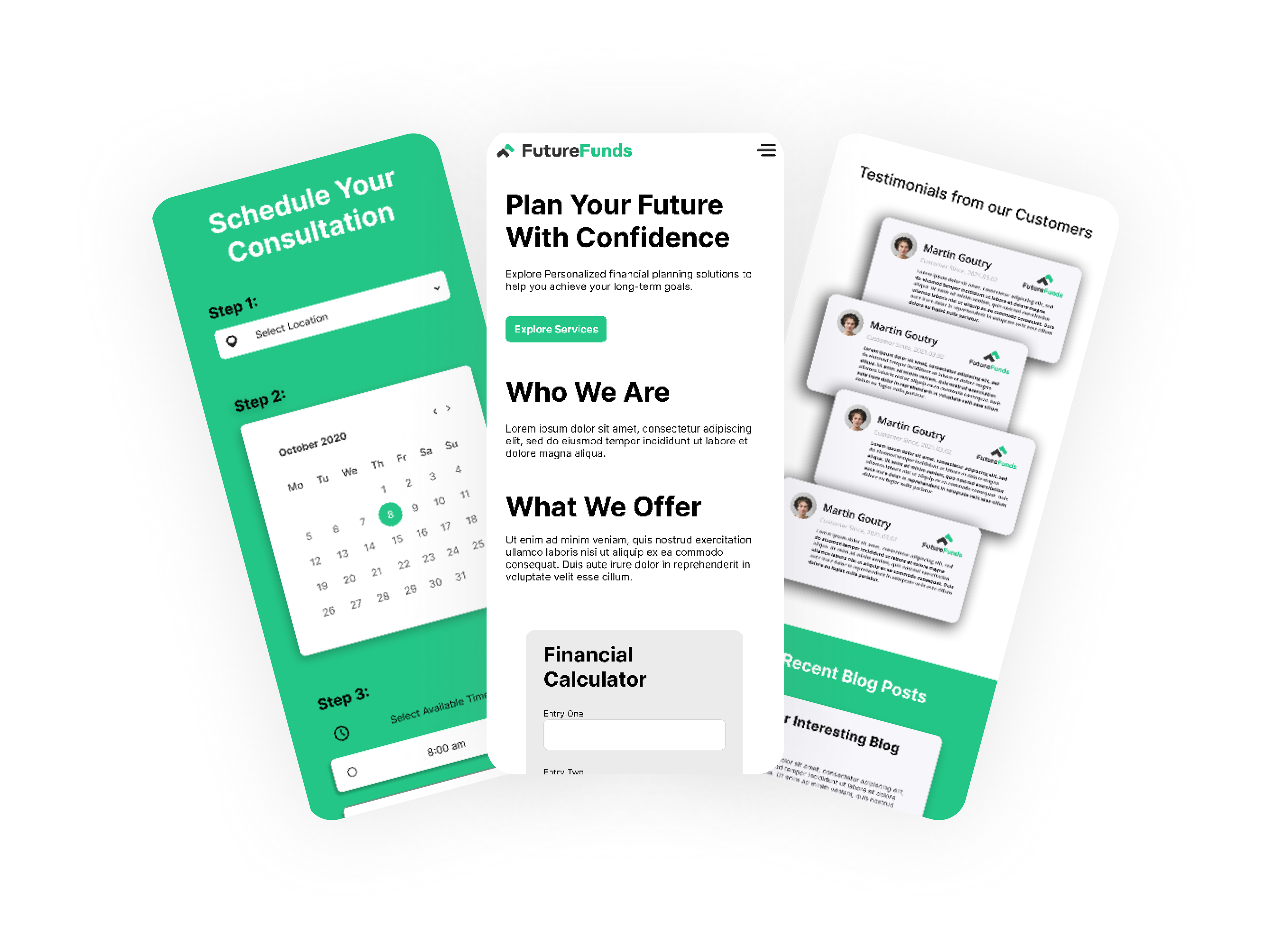
I led the redesign of the fictitious FutureFunds website, transforming a confusing, untrustworthy user experience into an intuitive and professional platform.
The Challenge
The original design failed on key UX principles. It had a poor visual hierarchy, inconsistent styling, and was not user-centric, creating a high cognitive load and failing to build user trust.
The Solution
I created new high-fidelity mockups in Figma for both desktop and mobile, focusing on a clean, user-friendly, and accessible experience.
Clear Hierarchy:
I established a strong visual structure with clear headlines and a primary call-to-action to guide users.
Responsive Design:
The layout was optimized for both desktop and mobile, ensuring usability on any device.
Improved Scheduler:
I completely overhauled the frustrating appointment scheduler, replacing it with an intuitive calendar and time picker.
Accessibility:
The design meets WCAG standards for color contrast and is structured for screen reader compatibility.
The next step is to finalize copy and function, validate these solutions through usability testing, and iterate on the design based on user feedback.